
json-render (vercel-labs fork) + real Image src, Pressable, self-contained Lightbox & Modal
 root
7c39f39038
docs(license): keep LICENSE as pristine Apache-2.0 for GitHub auto-detection
root
7c39f39038
docs(license): keep LICENSE as pristine Apache-2.0 for GitHub auto-detection
|
пре 2 месеци | |
|---|---|---|
| .cursor | пре 5 месеци | |
| .github | пре 3 месеци | |
| .husky | пре 7 месеци | |
| .vscode | пре 5 месеци | |
| apps | пре 2 месеци | |
| docs | пре 2 месеци | |
| examples | пре 2 месеци | |
| packages | пре 2 месеци | |
| scripts | пре 4 месеци | |
| skills | пре 2 месеци | |
| tests | пре 5 месеци | |
| .gitignore | пре 4 месеци | |
| .node-version | пре 3 месеци | |
| .npmrc | пре 7 месеци | |
| AGENTS.md | пре 4 месеци | |
| CHANGELOG.md | пре 3 месеци | |
| LICENSE | пре 2 месеци | |
| NOTICE | пре 2 месеци | |
| README.md | пре 2 месеци | |
| package.json | пре 3 месеци | |
| pnpm-lock.yaml | пре 2 месеци | |
| pnpm-workspace.yaml | пре 2 месеци | |
| turbo.json | пре 2 месеци | |
| vitest.config.mts | пре 5 месеци |
README.md
json-render — Oivo fork
A fork of vercel-labs/json-render with real image support, two self-contained interactive components, and a live playground wired to the ai.mm.mk gateway.
🔴 Live demo: https://jsonrender-demo.oivo.com/playground — type a sentence (e.g. "landing page for a coffee shop with a photo gallery and a sign-up button") and watch a UI build from the JSON spec.
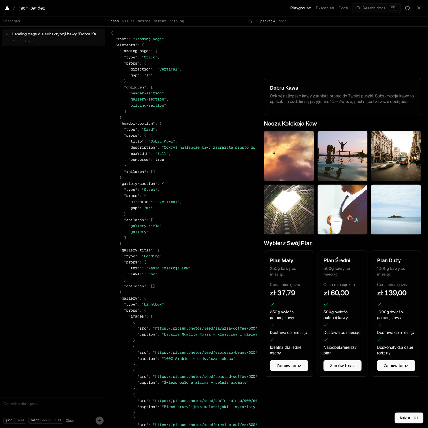
One sentence → a full landing page: JSON spec on the left, live preview (real-photo gallery + pricing cards) on the right.
Lightbox — click a thumbnail for a fullscreen gallery (prev/next, Esc to close):
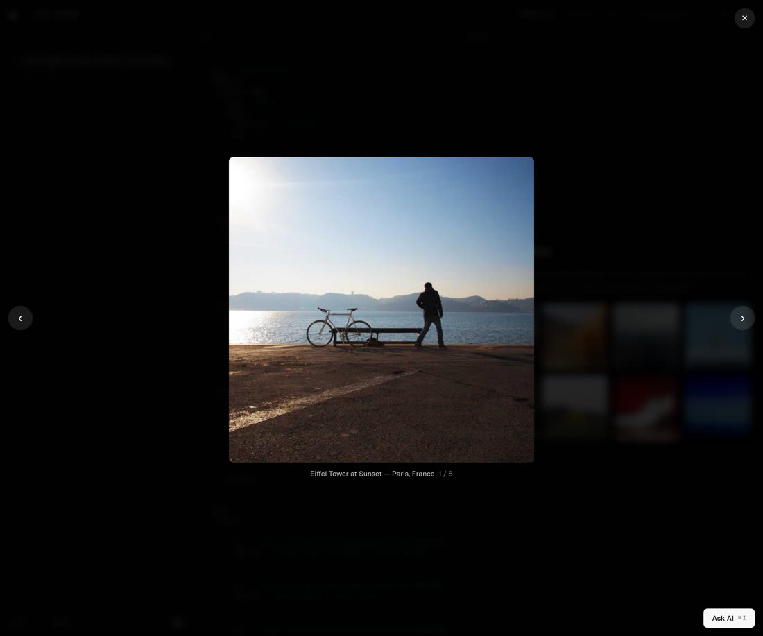
Modal — click a button for a centered popup form (Esc / backdrop / ✕ to close):

What this fork adds
Imagetakes a realsrc— renders an actual<img>(object-cover) when given a URL; falls back to a placeholder otherwise. Galleries usehttps://picsum.photos/seed/<word>/<w>/<h>.Pressable— a clickable container that wraps arbitrary children and emits apressevent.Lightbox— a self-contained photo gallery: thumbnail grid + fullscreen overlay with prev/next, keyboard nav, and click-outside/✕ close. Manages its own React state, so it works in the live preview without anysetStateaction.Modal— a self-contained modal: the element is the trigger button (triggerLabel) and renders its children inside a centered popup with Esc/backdrop/✕ close. Also fully self-stated — noDialog+setStatewiring.
Why "self-contained": the playground preview doesn't reliably drive
setState-action → cross-component re-renders, so click-to-open interactions (lightbox, modal) are built as components with their ownuseStateinstead.
Key files
| What | Path |
|---|---|
| Component implementations | apps/web/lib/render/registry.tsx |
| Component catalog (types + AI descriptions) | apps/web/lib/render/catalog.ts |
| Generation route + prompt rules + gateway | apps/web/app/api/generate/route.ts |
The generate route is pointed at the OpenAI-compatible ai.mm.mk gateway (default model anthropic/claude-haiku-4.5) via AI_API_URL / AI_API_KEY / AI_GATEWAY_MODEL.
License
This is a fork of vercel-labs/json-render, licensed under the Apache License 2.0 — the same license as upstream. Original work © 2025 Vercel Inc.; fork modifications © 2026 pch007 and contributors. See LICENSE for the full text and NOTICE for the attribution and a summary of changes.
json-render
The Generative UI framework.
Generate dynamic, personalized UIs from prompts without sacrificing reliability. Predefined components and actions for safe, predictable output.
# for React
npm install @json-render/core @json-render/react
# for React with pre-built shadcn/ui components
npm install @json-render/shadcn
# or for React Native
npm install @json-render/core @json-render/react-native
# or for video
npm install @json-render/core @json-render/remotion
# or for PDF documents
npm install @json-render/core @json-render/react-pdf
# or for HTML email
npm install @json-render/core @json-render/react-email @react-email/components @react-email/render
# or for Vue
npm install @json-render/core @json-render/vue
# or for Svelte
npm install @json-render/core @json-render/svelte
# or for SolidJS
npm install @json-render/core @json-render/solid
# or for terminal UIs
npm install @json-render/core @json-render/ink ink react
# or for full Next.js apps (routes, layouts, SSR, metadata)
npm install @json-render/core @json-render/react @json-render/next
# or for 3D scenes (and gaussian splatting via the GaussianSplat component)
npm install @json-render/core @json-render/react-three-fiber @react-three/fiber @react-three/drei three
Why json-render?
json-render is a Generative UI framework: AI generates interfaces from natural language prompts, constrained to components you define. You set the guardrails, AI generates within them:
- Guardrailed - AI can only use components in your catalog
- Predictable - JSON output matches your schema, every time
- Fast - Stream and render progressively as the model responds
- Cross-Platform - React, Vue, Svelte, Solid (web), React Native (mobile) from the same catalog
- Batteries Included - 36 pre-built shadcn/ui components ready to use
Quick Start
1. Define Your Catalog
import { defineCatalog } from "@json-render/core";
import { schema } from "@json-render/react/schema";
import { z } from "zod";

const catalog = defineCatalog(schema, {
  components: {
    Card: {
      props: z.object({ title: z.string() }),
      description: "A card container",
    },
    Metric: {
      props: z.object({
        label: z.string(),
        value: z.string(),
        format: z.enum(["currency", "percent", "number"]).nullable(),
      }),
      description: "Display a metric value",
    },
    Button: {
      props: z.object({
        label: z.string(),
        action: z.string(),
      }),
      description: "Clickable button",
    },
  },
  actions: {
    export_report: { description: "Export dashboard to PDF" },
    refresh_data: { description: "Refresh all metrics" },
  },
});
2. Define Your Components
import { defineRegistry, Renderer } from "@json-render/react";

const { registry } = defineRegistry(catalog, {
  components: {
    Card: ({ props, children }) => (
      <div className="card">
        <h3>{props.title}</h3>
        {children}
      </div>
    ),
    Metric: ({ props }) => (
      <div className="metric">
        <span>{props.label}</span>
        <span>{format(props.value, props.format)}</span>
      </div>
    ),
    Button: ({ props, emit }) => (
      <button onClick={() => emit("press")}>{props.label}</button>
    ),
  },
});
3. Render AI-Generated Specs
function Dashboard({ spec }) {
  return <Renderer spec={spec} registry={registry} />;
}
That's it. AI generates JSON, you render it safely.
Packages
| Package | Description |
|---|---|
@json-render/core |
Schemas, catalogs, AI prompts, dynamic props, SpecStream utilities |
@json-render/react |
React renderer, contexts, hooks |
@json-render/vue |
Vue 3 renderer, composables, providers |
@json-render/svelte |
Svelte 5 renderer with runes-based reactivity |
@json-render/solid |
SolidJS renderer with fine-grained reactive contexts |
@json-render/shadcn |
36 pre-built shadcn/ui components (Radix UI + Tailwind CSS) |
@json-render/shadcn-svelte |
36 pre-built shadcn-svelte components (Svelte 5 + Tailwind CSS) |
@json-render/react-three-fiber |
React Three Fiber renderer for 3D scenes (20 built-in components, including GaussianSplat) |
@json-render/react-native |
React Native renderer with standard mobile components |
@json-render/next |
Next.js renderer — JSON becomes full apps with routes, layouts, SSR |
@json-render/remotion |
Remotion video renderer, timeline schema |
@json-render/react-pdf |
React PDF renderer for generating PDF documents from specs |
@json-render/react-email |
React Email renderer for HTML/plain-text emails from specs |
@json-render/ink |
Ink terminal renderer with built-in components for interactive TUIs. |
@json-render/image |
Image renderer for SVG/PNG output (OG images, social cards) via Satori |
@json-render/directives |
Pre-built custom directives — $format, $math, $concat, $count, $truncate, $pluralize, $join, $t (i18n) |
@json-render/codegen |
Utilities for generating code from json-render UI trees |
@json-render/devtools |
Framework-agnostic devtools core — panel UI, event store, picker, stream taps |
@json-render/devtools-react |
React adapter for @json-render/devtools (drop-in <JsonRenderDevtools />) |
@json-render/devtools-vue |
Vue adapter for @json-render/devtools |
@json-render/devtools-svelte |
Svelte adapter for @json-render/devtools |
@json-render/devtools-solid |
SolidJS adapter for @json-render/devtools |
@json-render/redux |
Redux / Redux Toolkit adapter for StateStore |
@json-render/zustand |
Zustand adapter for StateStore |
@json-render/jotai |
Jotai adapter for StateStore |
@json-render/xstate |
XState Store (atom) adapter for StateStore |
@json-render/mcp |
MCP Apps integration for Claude, ChatGPT, Cursor, VS Code |
@json-render/yaml |
YAML wire format with streaming parser, edit modes, AI SDK transform |
Renderers
React (UI)
import { defineRegistry, Renderer } from "@json-render/react";
import { schema } from "@json-render/react/schema";

// Flat spec format (root key + elements map)
const spec = {
  root: "card-1",
  elements: {
    "card-1": {
      type: "Card",
      props: { title: "Hello" },
      children: ["button-1"],
    },
    "button-1": {
      type: "Button",
      props: { label: "Click me" },
      children: [],
    },
  },
};

// defineRegistry creates a type-safe component registry
const { registry } = defineRegistry(catalog, { components });
<Renderer spec={spec} registry={registry} />;
Vue (UI)
import { h } from "vue";
import { defineRegistry, Renderer } from "@json-render/vue";
import { schema } from "@json-render/vue/schema";

const { registry } = defineRegistry(catalog, {
  components: {
    Card: ({ props, children }) =>
      h("div", { class: "card" }, [h("h3", null, props.title), children]),
    Button: ({ props, emit }) =>
      h("button", { onClick: () => emit("press") }, props.label),
  },
});

// In your Vue component template:
// <Renderer :spec="spec" :registry="registry" />
Svelte (UI)
import { defineRegistry, Renderer } from "@json-render/svelte";
import { schema } from "@json-render/svelte/schema";

const { registry } = defineRegistry(catalog, {
  components: {
    Card: ({ props, children }) => /* Svelte 5 snippet */,
    Button: ({ props, emit }) => /* Svelte 5 snippet */,
  },
});

// In your Svelte component:
// <Renderer spec={spec} registry={registry} />
Solid (UI)
import { defineRegistry, Renderer } from "@json-render/solid";
import { schema } from "@json-render/solid/schema";

const { registry } = defineRegistry(catalog, {
  components: {
    Card: (renderProps) => <div>{renderProps.children}</div>,
    Button: (renderProps) => (
      <button onClick={() => renderProps.emit("press")}>
        {renderProps.element.props.label as string}
      </button>
    ),
  },
});

<Renderer spec={spec} registry={registry} />;
shadcn/ui (Web)
import { defineCatalog } from "@json-render/core";
import { schema } from "@json-render/react/schema";
import { defineRegistry, Renderer } from "@json-render/react";
import { shadcnComponentDefinitions } from "@json-render/shadcn/catalog";
import { shadcnComponents } from "@json-render/shadcn";

// Pick components from the 36 standard definitions
const catalog = defineCatalog(schema, {
  components: {
    Card: shadcnComponentDefinitions.Card,
    Stack: shadcnComponentDefinitions.Stack,
    Heading: shadcnComponentDefinitions.Heading,
    Button: shadcnComponentDefinitions.Button,
  },
  actions: {},
});

// Use matching implementations
const { registry } = defineRegistry(catalog, {
  components: {
    Card: shadcnComponents.Card,
    Stack: shadcnComponents.Stack,
    Heading: shadcnComponents.Heading,
    Button: shadcnComponents.Button,
  },
});

<Renderer spec={spec} registry={registry} />;
React Native (Mobile)
import { defineCatalog } from "@json-render/core";
import { schema } from "@json-render/react-native/schema";
import {
  standardComponentDefinitions,
  standardActionDefinitions,
} from "@json-render/react-native/catalog";
import { defineRegistry, Renderer } from "@json-render/react-native";

// 25+ standard components included
const catalog = defineCatalog(schema, {
  components: { ...standardComponentDefinitions },
  actions: standardActionDefinitions,
});

const { registry } = defineRegistry(catalog, { components: {} });
<Renderer spec={spec} registry={registry} />;
Remotion (Video)
import { Player } from "@remotion/player";
import {
  Renderer,
  schema,
  standardComponentDefinitions,
} from "@json-render/remotion";

// Timeline spec format
const spec = {
  composition: {
    id: "video",
    fps: 30,
    width: 1920,
    height: 1080,
    durationInFrames: 300,
  },
  tracks: [{ id: "main", name: "Main", type: "video", enabled: true }],
  clips: [
    {
      id: "clip-1",
      trackId: "main",
      component: "TitleCard",
      props: { title: "Hello" },
      from: 0,
      durationInFrames: 90,
    },
  ],
  audio: { tracks: [] },
};

<Player
  component={Renderer}
  inputProps={{ spec }}
  durationInFrames={spec.composition.durationInFrames}
  fps={spec.composition.fps}
  compositionWidth={spec.composition.width}
  compositionHeight={spec.composition.height}
/>;
React PDF (Documents)
import { renderToBuffer } from "@json-render/react-pdf";

const spec = {
  root: "doc",
  elements: {
    doc: {
      type: "Document",
      props: { title: "Invoice" },
      children: ["page-1"],
    },
    "page-1": {
      type: "Page",
      props: { size: "A4" },
      children: ["heading-1", "table-1"],
    },
    "heading-1": {
      type: "Heading",
      props: { text: "Invoice #1234", level: "h1" },
      children: [],
    },
    "table-1": {
      type: "Table",
      props: {
        columns: [
          { header: "Item", width: "60%" },
          { header: "Price", width: "40%", align: "right" },
        ],
        rows: [
          ["Widget A", "$10.00"],
          ["Widget B", "$25.00"],
        ],
      },
      children: [],
    },
  },
};

// Render to buffer, stream, or file
const buffer = await renderToBuffer(spec);
React Email (Email)
import { renderToHtml } from "@json-render/react-email";
import { schema, standardComponentDefinitions } from "@json-render/react-email";
import { defineCatalog } from "@json-render/core";

const catalog = defineCatalog(schema, {
  components: standardComponentDefinitions,
});

const spec = {
  root: "html-1",
  elements: {
    "html-1": {
      type: "Html",
      props: { lang: "en", dir: "ltr" },
      children: ["head-1", "body-1"],
    },
    "head-1": { type: "Head", props: {}, children: [] },
    "body-1": {
      type: "Body",
      props: { style: { backgroundColor: "#f6f9fc" } },
      children: ["container-1"],
    },
    "container-1": {
      type: "Container",
      props: {
        style: { maxWidth: "600px", margin: "0 auto", padding: "20px" },
      },
      children: ["heading-1", "text-1"],
    },
    "heading-1": { type: "Heading", props: { text: "Welcome" }, children: [] },
    "text-1": {
      type: "Text",
      props: { text: "Thanks for signing up." },
      children: [],
    },
  },
};

const html = await renderToHtml(spec);
Image (SVG/PNG)
import { renderToPng } from "@json-render/image/render";

const spec = {
  root: "frame",
  elements: {
    frame: {
      type: "Frame",
      props: { width: 1200, height: 630, backgroundColor: "#1a1a2e" },
      children: ["heading"],
    },
    heading: {
      type: "Heading",
      props: { text: "Hello World", level: "h1", color: "#ffffff" },
      children: [],
    },
  },
};

// Render to PNG (requires @resvg/resvg-js)
const png = await renderToPng(spec, { fonts });

// Or render to SVG string
import { renderToSvg } from "@json-render/image/render";
const svg = await renderToSvg(spec, { fonts });
Three.js (3D)
import { defineCatalog } from "@json-render/core";
import { schema, defineRegistry } from "@json-render/react";
import {
  threeComponentDefinitions,
  threeComponents,
  ThreeCanvas,
} from "@json-render/react-three-fiber";

const catalog = defineCatalog(schema, {
  components: {
    Box: threeComponentDefinitions.Box,
    Sphere: threeComponentDefinitions.Sphere,
    AmbientLight: threeComponentDefinitions.AmbientLight,
    DirectionalLight: threeComponentDefinitions.DirectionalLight,
    GaussianSplat: threeComponentDefinitions.GaussianSplat,
    OrbitControls: threeComponentDefinitions.OrbitControls,
  },
  actions: {},
});

const { registry } = defineRegistry(catalog, {
  components: {
    Box: threeComponents.Box,
    Sphere: threeComponents.Sphere,
    AmbientLight: threeComponents.AmbientLight,
    DirectionalLight: threeComponents.DirectionalLight,
    GaussianSplat: threeComponents.GaussianSplat,
    OrbitControls: threeComponents.OrbitControls,
  },
});

<ThreeCanvas
  spec={spec}
  registry={registry}
  shadows
  camera={{ position: [5, 5, 5], fov: 50 }}
  style={{ width: "100%", height: "100vh" }}
/>;
Next.js (Full Apps)
import type { NextAppSpec } from "@json-render/next";
import { createNextApp } from "@json-render/next/server";
import { NextAppProvider } from "@json-render/next";

const spec: NextAppSpec = {
  metadata: { title: { default: "My App", template: "%s | My App" } },
  layouts: {
    main: {
      root: "shell",
      elements: {
        shell: { type: "Container", props: {}, children: ["nav", "slot"] },
        nav: { type: "NavBar", props: {}, children: [] },
        slot: { type: "Slot", props: {}, children: [] },
      },
    },
  },
  routes: {
    "/": {
      layout: "main",
      metadata: { title: "Home" },
      page: {
        root: "hero",
        elements: {
          hero: { type: "Card", props: { title: "Welcome" }, children: [] },
        },
      },
    },
  },
};

// Server: creates Page, generateMetadata, generateStaticParams
const app = createNextApp({ spec });

// Client: wrap your layout with NextAppProvider
// <NextAppProvider registry={registry} handlers={handlers}>
//   {children}
// </NextAppProvider>
shadcn-svelte (Svelte)
import { defineCatalog } from "@json-render/core";
import { schema } from "@json-render/svelte/schema";
import { defineRegistry, Renderer } from "@json-render/svelte";
import { shadcnComponentDefinitions } from "@json-render/shadcn-svelte/catalog";
import { shadcnComponents } from "@json-render/shadcn-svelte";

const catalog = defineCatalog(schema, {
  components: {
    Card: shadcnComponentDefinitions.Card,
    Stack: shadcnComponentDefinitions.Stack,
    Heading: shadcnComponentDefinitions.Heading,
    Button: shadcnComponentDefinitions.Button,
  },
  actions: {},
});

const { registry } = defineRegistry(catalog, {
  components: {
    Card: shadcnComponents.Card,
    Stack: shadcnComponents.Stack,
    Heading: shadcnComponents.Heading,
    Button: shadcnComponents.Button,
  },
});

// In your Svelte component:
// <Renderer spec={spec} registry={registry} />
Devtools
Drop-in inspector panel for any json-render app. Spec tree, state editor, action log, stream log, catalog browser, DOM picker.
// React
import { JsonRenderDevtools } from "@json-render/devtools-react";

<JSONUIProvider registry={registry} handlers={handlers}>
  <Renderer spec={spec} registry={registry} />
  <JsonRenderDevtools spec={spec} catalog={catalog} messages={messages} />
</JSONUIProvider>;
Floating toggle appears bottom-right. Hotkey: Ctrl/Cmd + Shift + J. Tree-shakes to null in production.
Available for React, Vue, Svelte, and Solid — swap @json-render/devtools-react for the adapter that matches your renderer.
Ink (Terminal)
import { defineCatalog } from "@json-render/core";
import {
  schema,
  standardComponentDefinitions,
  standardActionDefinitions,
  defineRegistry,
  Renderer,
  JSONUIProvider,
} from "@json-render/ink";

const catalog = defineCatalog(schema, {
  components: { ...standardComponentDefinitions },
  actions: standardActionDefinitions,
});

const { registry } = defineRegistry(catalog, { components: {} });

const spec = {
  root: "card-1",
  elements: {
    "card-1": {
      type: "Card",
      props: { title: "Status" },
      children: ["status-1"],
    },
    "status-1": {
      type: "StatusLine",
      props: { label: "Build", status: "success" },
      children: [],
    },
  },
};

<JSONUIProvider initialState={{}}>
  <Renderer spec={spec} registry={registry} />
</JSONUIProvider>;
Features
Streaming (SpecStream)
Stream AI responses progressively:
import { createSpecStreamCompiler } from "@json-render/core";

const compiler = createSpecStreamCompiler<MySpec>();

// Process chunks as they arrive
const { result, newPatches } = compiler.push(chunk);
setSpec(result); // Update UI with partial result

// Get final result
const finalSpec = compiler.getResult();
AI Prompt Generation
Generate system prompts from your catalog:
const systemPrompt = catalog.prompt();
// Includes component descriptions, props schemas, available actions
Conditional Visibility
{
  "type": "Alert",
  "props": { "message": "Error occurred" },
  "visible": [
    { "$state": "/form/hasError" },
    { "$state": "/form/errorDismissed", "not": true }
  ]
}
Dynamic Props
Any prop value can be data-driven using expressions:
{
  "type": "Icon",
  "props": {
    "name": {
      "$cond": { "$state": "/activeTab", "eq": "home" },
      "$then": "home",
      "$else": "home-outline"
    },
    "color": {
      "$cond": { "$state": "/activeTab", "eq": "home" },
      "$then": "#007AFF",
      "$else": "#8E8E93"
    }
  }
}
Expression forms:
{ "$state": "/state/key" }- reads a value from the state model{ "$cond": <condition>, "$then": <value>, "$else": <value> }- evaluates a condition and picks a branch{ "$template": "Hello, ${/user/name}!" }- interpolates state values into strings{ "$computed": "fn", "args": { ... } }- calls a registered function with resolved args
Actions
Components can trigger actions, including the built-in setState action:
{
  "type": "Pressable",
  "props": {
    "action": "setState",
    "actionParams": { "statePath": "/activeTab", "value": "home" }
  },
  "children": ["home-icon"]
}
The setState action updates the state model directly, which re-evaluates visibility conditions and dynamic prop expressions.
State Watchers
React to state changes by triggering actions:
{
  "type": "Select",
  "props": {
    "value": { "$bindState": "/form/country" },
    "options": ["US", "Canada", "UK"]
  },
  "watch": {
    "/form/country": {
      "action": "loadCities",
      "params": { "country": { "$state": "/form/country" } }
    }
  }
}
watch is a top-level field on elements (sibling of type/props/children). Watchers fire when the watched value changes, not on initial render.
Demo
git clone https://github.com/vercel-labs/json-render
cd json-render
pnpm install
pnpm dev
- http://json-render.localhost:1355 - Docs & Playground
- http://dashboard-demo.json-render.localhost:1355 - Example Dashboard
- http://react-email-demo.json-render.localhost:1355 - React Email Example
- http://remotion-demo.json-render.localhost:1355 - Remotion Video Example
- Chat Example: run
pnpm devinexamples/chat - Svelte Example: run
pnpm devinexamples/svelteorexamples/svelte-chat - Vue Example: run
pnpm devinexamples/vue - Vite Renderers (React + Vue + Svelte + Solid): run
pnpm devinexamples/vite-renderers - React Native example: run
npx expo startinexamples/react-native - Gaussian Splatting (R3F): run
pnpm devinexamples/react-three-fiber-gsplat - Gaussian Splatting (experimental standalone gsplat.js demo): run
pnpm devinexamples/gsplat
How It Works
flowchart LR
    A[User Prompt] --> B[AI + Catalog]
    B --> C[JSON Spec]
    C --> D[Renderer]

    B -.- E([guardrailed])
    C -.- F([predictable])
    D -.- G([streamed])
- Define the guardrails - what components, actions, and data bindings AI can use
- Prompt - describe what you want in natural language
- AI generates JSON - output is always predictable, constrained to your catalog
- Render fast - stream and render progressively as the model responds
License
Apache-2.0